1
2
3
You can use the grid-areas property to name grid items.
You can refer to the name when you set up the grid layout, by using the grid property on the grid container.
This grid layout contains six columns and three rows:
See 'grid-area' at the end of this page
for more...but for now (a brief bit)...
My little explanation of one way of using the
grid - Above this area is a grid layout with each section of the grid
labelled as Header, Menu, Main, Right & Footer
The grid-area
can property can be used to assign a name to a grid item. Named grid items can then
be referenced to by the
grid-template-areas
property of the grid container.
Note... The grid property is a shorthand property for various
grid properties (including grid-template-area) and my example uses this method.
.item1 { grid-area: header; }
.item2 { grid-area: menu; }
.item3 { grid-area: main; }
.item4 { grid-area: right; }
.item5 { grid-area: footer; }
.grid-container {
display: grid;
//(or use - display:inline-grid)
grid:
'header header header header header header'
'menu main main main right right'
'menu footer footer footer footer footer';
grid-gap: 10px;
background-color: #2196F3;
padding: 10px;
}
Note...
Each name (header, menu, main etc) represents a grid element.
This shows the header takes up 6 columns
while the menu only takes up 1 column (but 2 rows).
If you wanted the menu to take up 2 columns you would need to replace a main with the menu name
and also a footer with the menu name (as it is on both rows)
Eg...
grid:
'header header header header header header'
'menu menu main main right right'
'menu menu footer footer footer footer';
By default, grids contain only one column.
If you were to start adding items, each item would be put on a new row; that’s not
much of a grid! To change this, we need to explicitly define the number
of rows and columns in our grid.
We can define the columns of our grid by using the CSS property
grid-template-columns:
.grid {
display: grid;
width: 500px;
grid-template-columns: 100px 200px;
}
This property creates two changes.
First, it defines the number of columns in the grid; in this case, there are two.
Second, it sets the width of each column.
The first column will be 100 pixels wide and the second column will be 200 pixels wide.
We can also define the size of our columns as a percentage of the entire grid’s width.
grid-template-columns: 20% 50%;
We can also mix and match...
grid-template-columns: 100px 50%;
If you are not careful then the grid items can go outside of the boundaries of the grid
eg... if the grid has a width:500px
and grid-template-column:200px 200px 200px;
AS WELL AS %-ages and px's for the sizes there is also fr.
This means FRACTIONS (although I would say it is really PARTS), eg...
Whatever the size of the grid cell if you say
grid-template-columns: 2fr 1fr 2fr;
Then it will split the cell into 5 equal parts and allocate 2 parts to the first section, 1 part to
the second section and 2 parts to the third section.
And just to complicate matters more you can mix fr and % and px as well.
So grid-template-columns: 2fr 50% 2fr;
Will now split the cell into one part being 50% of the grid size and the remaining 50% will be
split into 4 equal parts.
It will then allocate 2 parts to the first section,
50% of the size of the grid to the second section
and the remaining 2 parts to the third section.
By default, the rows are sized to fit evenly inside the grid.
We can set the height of each row manually by...
We can define the rows of our grid by using the CSS property
grid-template-rows:
.grid {
display: grid;
width: 500px;
heaight: 700px;
grid-template-columns: 100px 200px;
grid-template-rows: 20% 30% 500px;
}
Very similar to grid-template-columns, you can use %-ages and/or px's to set the height.
If you are not careful then the grid items can go outside of the boundaries of the grid
eg... if the grid has a height:500px
and grid-template-rows:200px 200px 200px;
The grid-template property is a shorthand property for the following properties
grid-template-rows, grid-template-columns and grid-template-areas
.grid {
display: grid;
width: 500px;
height: 700px;
grid-template: 20% 30% 500px / 100px 200px;
}
NOTE...
The format is ROWS then COLUMNS then AREAS
Example of...
grid-gap: 10px;
grid-row-gap: 10px;
grid-column-gap: 10px;
NOTE...
grid-gap, grid-row-gap and grid-column-gap was renamed to gap, row-gap and column-gap in CSS3.
If you want a gap between the columns in your grid you can use
grid-column-gap: 10px;
This affects the size of the columns when using %-ages or fr's, eg...
Let’s quickly calculate how wide these columns are.
Remember that using fr considers all of the available space.
The grid is 320 pixels wide and 20 of those pixels are taken up by the two grid gaps.
Therefore each column takes a piece of the 300 available pixels.
Each column gets 1fr, so the columns are evenly divided into thirds (or 100 pixels each).
>And there is also a
Example of
grid-template: repeat(3, 1fr) / 3fr 50% 1fr;
grid-gap: 10px;
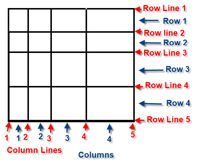
Think of a grid made up rows and columns.
With Row Lines and Column Lines.
So row 1 begins at line 1 but ends at line 2 and
row 2 begins at line 2 and ends at line 3 and
row 3 begins at line 3 and ends at line 4...etc
See example in next box...
Example of...
grid-row: 1 / 3;
grid-row-start: 1;
grid-row-end: 3;
Basically, you can specify where you want your row of cells to start and end
grid-row: 1 / 3;
means start at row line 1 and end at row line 3
which will give you a cell spanning two rows.
(you can also say grid-row: 1 / span 2 which will do the same thing)
There are ALSO properties for the columns...
Example of...
grid-column: 1 / 3;
grid-column-start: 1;
grid-column-end: 3;
Grid layout example, rows & columns...
Example grid with...
The grid is a simple 4 x 4 with equal spaced cells
specification of
grid-template: repeat(4, 1fr) / repeat(4, 1fr);
grid-gap: 5px;
and box a covers two rows, one cell (row 3 & 4, starting on line 3 & ending at line 5)
grid-row: 3 / 5;
I could also have said grid-row: 3 / span 2;
and box b covers one row, two cells (row 4 only, starting on line 4 & ending at line 5)
grid-row: 4 / 5;
grid-column: 2 / span 2;
There is also a
grid-area: ...;
This is a shorthand property that covers grid-row-start, grid-column-start, grid-row-end, and
grid-column-end
.
Example 1
Make "item1" start on row 2 column 1, and span 2 rows and 3 columns:
.item1 {
grid-area: 2 / 1 / span 2 / span 3;
}
Which is actually...
grid-area: Start Row Line / Start Column Line / Span over 2 Rows / Span over 3 Columns;
You can use the grid-area property to name grid items.
You can refer to the name when you set up the grid layout, by using the grid-template-areas property on the grid container.
Item 1, is called "myArea" and will take up the place of two columns (out of five):
This is the CODE to show how it works...
In the <head> area in the <styles> section is the following:-
.item5_1 {
grid-area: myArea;
font-size: 16px !important
}
.grid-container5 {
display: grid;
/* make ROWS same size & make COLUMNS same size */
grid-template: repeat(2, 1fr) / repeat(5, 1fr);
/* I only NAMED one item ('myArea') so use dots to fill out to 5 columns */
grid-template-areas: 'myArea myArea . . .';
grid-gap: 5px;
background-color: #2196F3;
padding: 10px;
}
.grid-container5 > div {
background-color: rgba(255, 255, 255, 0.8);
text-align: center;
padding: 20px 0;
font-size: 30px;
}
And the code for the grid is:-
<div class="grid-container5">
<div class="item5_1">1 (myArea)</div>
<div class="item5_2">2</div>
<div class="item5_3">3</div>
<div class="item5_4">4</div>
<div class="item5_5">5</div>
<div class="item5_6">6</div>
<div class="item5_7">7</div>
<div class="item5_8">8</div>
<div class="item5_9">9</div>
</div>
Use
justify-content
to position the entire
grid along the horizontal axis.
So if you have 2 cells on a row with 4 columns and then you set
justify-content: flex-end; then the two cells will be closer to the end (right) of the grid.
justify-content: center; then
the two cells will be in the middle of the grid with a blank area at
the start and a blank area at the end.
justify-content: flex-start; then
the two cells will be closer to the start (left) of the grid.
justify-content:flex-end;
justify-content:center;
justify-content:flex-start;
justify-content:left;align-items:flex-end;
justify-content:left;align-items:flex-start;
justify-content:left;align-items:stretch;
align-content:
flex-end; center; flex-start;
Explicit Grid
You can set the actual size of your grid by specifying the number of columns and the number of rows
you require.
Implicit Grid>
When you do not know how many Rows and/or Columns you need for your grid this is known as an Implicit Grid.
"What happens if the developer has specified a 3-column, 5-row grid (for a total of 15 items),
but the search results return 30?
Something called the implicit grid takes over. The implicit grid is an algorithm built into the
specification for CSS Grid that determines default behavior for the placement
of elements when there are more than fit into the grid specified by the CSS.
The default behavior of the implicit grid is as follows:
items fill up rows first, adding new rows as necessary.
New grid rows will only be tall enough to contain the content within them."
For Implicit Grids you need to use
grid-auto-rows:
and/or
grid-auto-columns:
These properties are declared on grid containers.
grid-auto-rows specifies the height of implicitly added grid rows.
grid-auto-columns specifies the width of implicitly added grid columns.
grid-auto-rows and grid-auto-columns accept the same values as their explicit counterparts,
grid-template-rows and grid-template-columns: (px, %, fr and the repeat funtion).
ALSO SEE...
grid-auto-flow:
The grid-auto-flow: property controls how auto-placed items get inserted in the grid.
grid layouts are two-dimensional: they have a row, or inline, axis and a column, or block, axis.
justify-items
specifies how individual elements should spread across the row axis
justify-content
specifies how groups of elements should spread across the row axis
justify-self
specifies how a single element should position itself with respect to the row axis.
It is added to each cell item, rather than the grid itself and it will override
the justify-items: property settings for that particular cell.
align-items
specifies how individual elements should spread across the column axis
align-content
specifies how groups of elements should spread across the column axis
align-self
specifies how a single element should position itself with respect to the column axis.
It is added to each cell item, rather than the grid itself and it will override
the align-items: property settings for that particular cell.
grid
The grid property is a shorthand property for:-
grid-template-rows, grid-template-columns, grid-template-areas,
grid-auto-rows, grid-auto-columns, grid-auto-flow
grid-template
This property is a shorthand property for:-
grid-template-rows, grid-template-columns, grid-template-areas
grid-template-rows
specifies how many rows and the height of rows added to the grid
grid-template-columns
specifies how many and the width of columns added to the grid
grid-template-areas
specifies areas within the grid layout.
You can name grid items by using the grid-area property, and then reference
to the name in the grid-template-areas property.
Each area is defined by apostrophes.
Use a period sign to refer to a grid item with no name.
grid-auto-rows
specifies the height of rows added automatically to the grid.
This property affects only rows with the size not set.
grid-auto-columns
specifies the width of columns added implicitly to the grid,
This property affects only columns with the size not set.
grid-auto-flow
specifies how auto-placed items get inserted in the grid.
grid-area
This is a shorthand property for the following properties:
grid-row-start, grid-column-start, grid-row-end and grid-column-end.
grid-row
The grid-row property is shorthand for:-
grid-row-start and grid-row-end
grid-row-start
This property defines on which row-line the item will start.
grid-row-end
This property defines on which row-line the item will end.
or (using span) how many rows the item will span.
grid-column
The grid-column property is shorthand for:-
grid-column-start and grid-column-end
grid-column-start
This property defines on which column-line the item will start.
grid-column-end
This property defines on which column-line the item will end.
or (using span) how many columns the item will span.
grid-gap, grid-row-gap and grid-column-gap was renamed to gap, row-gap and column-gap in CSS3.
gap
The grid-gap property is shorthand for:-
row-gap and column-gap
row-gap
This property defines the size of the gap between the rows in a grid layout.
column-gap
This property defines the size of the gap between the columns in a grid layout.
Flexbox is essentially for laying out items in a single dimension – in a row OR a column.
Grid is for layout of items in two dimensions – rows AND columns.
Also, take a look at
Things I've Learned About CSS Grid Layout
- by Ollie Williams